AmazonFresh.com had launched in 2007 and not changed much in layout or look and feel. I built the new design from concept to launch, including all UX and visual design, sell-through to leadership, asset creation, functional specifications, CSS, art direction, usability testing, etc.
It was well-received by customers, and the new elevated aesthetic plus promotional placements led to a dramatic increase in co-op ad sales which was key to AmazonFresh being green-lighted to expand beyond its Seattle pilot test.
The redesign accomplished these goals:
-
Modernize aesthetic to better reflect the product and brand: premium service, upscale, “foodie”, world-class.
-
Improve core UX: Unify interdependent controls, surface notifications & messaging.
-
Responsive design that would look great and work well on desktop or tablets.
-
Dramatically increase the number of promo & ad placements on the homepage.
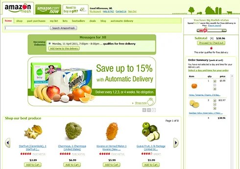
Before Redesign
Problem:
-
AmazonFresh was touted as a premium service but the site still looked and functioned as a budget alpha launch.
-
Poor visual design choices, including outdated aesthetics and UI styles, inconsistent palette, inflexible and limited ad placements, inelegant typography, poor use of layout and whitespace, etc.
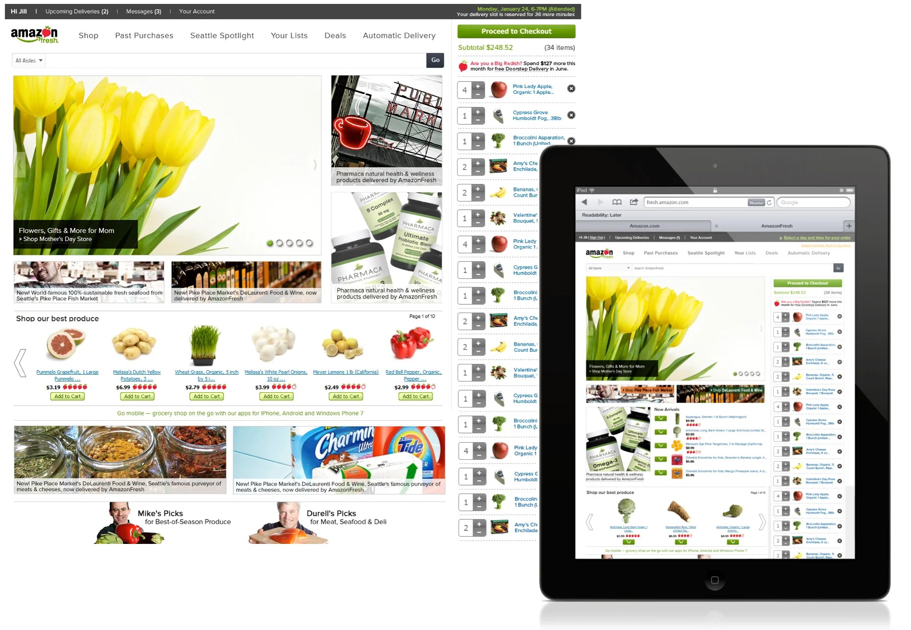
After: Responsive, Touch-Friendly Layout
The new site was built on a custom grid layout that I designed to work seamlessly in landscape or portrait modes, along with improved typography, streamlined palette, and other aesthetic improvements.
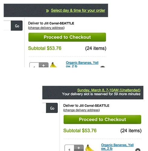
After: Better Delivery Scheduling
Global access to delivery scheduling information while shopping the site.
This design pattern was later used by other Amazon teams with delivery- and threshold-based services, including AmazonFresh when it launched on Amazon.com in 2016.