Measuring Magic: How We Can Do Better than “I Know It When I See It”
Designing the future of tech using the HAPI emotional model
Transcript from my lightning talk at Conflux: Future Possible (Amazon design conference) 9/21/2017 and Tokyo Design Forum 10/12/2017.

Maybe like you, I’ve been asked to design “magical” experiences. I’ve worked on early-stage voice shopping, predictive carts, and now physical stores like Amazon Go.
Magic IS our business.
But sometimes our greatest achievements are met with a mixture of excitement and fear, such as around privacy or intrusion:
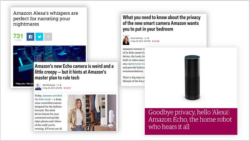
So how do we know what is… “cool” or “creepy”, “seamless”, “intuitive”… or even “magical”?
Emotional qualities like these can be hard to define and, when you ask someone to do so, you often get a response like — as written into U.S. obscenity law:
But come on… This is Amazon.
We can do better than “I know it when I see it.”
How?
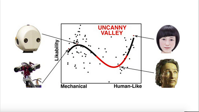
An example is the “Uncanny Valley” concept by Japanese robotics professor Masahiro Mori in the 1970s, which I think still holds up. The general idea being that between a robot looking and sounding like a robot, and a human looking and sounding like a human, there is a range of combinations that may seem friendly or familiar… or “off” or creepy:
In a similar vein, I’ve developed the HAPI Model — a framework or tool we can use when designing or user testing new products, which works on a spectrum of Normal to Magic to Fear:
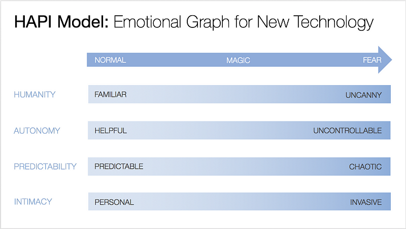
Just to run through these quickly:
Humanity: This is basically the “uncanny valley” concept I showed you earlier, for humanoid things, like with voices or faces.
Autonomy: This goes from a [monthly scheduled delivery] — “set it and forget it”— to random packages appearing on my doorstep because maybe a machine thinks I wanted them.
Predictability: This is the difference between what we usually call “surprise & delight,” like Alexa’s new skill last week: Alexa, sound like a cat… to Alexa making animal noises day and night whenever she feels like it.
and
Intimacy: This goes from “Hi Jill” on the [Amazon.com homepage]… to walking in the door and hearing “Hi Jill. I don’t really like that dress on you, and you look a little tired to today.”
And the perception of these shifts to Normal…
over time… such as generational acceptance, or
over value… what discomfort people are willing to trade for convenience or benefit.
Here’s a favorite tweet on the topic:
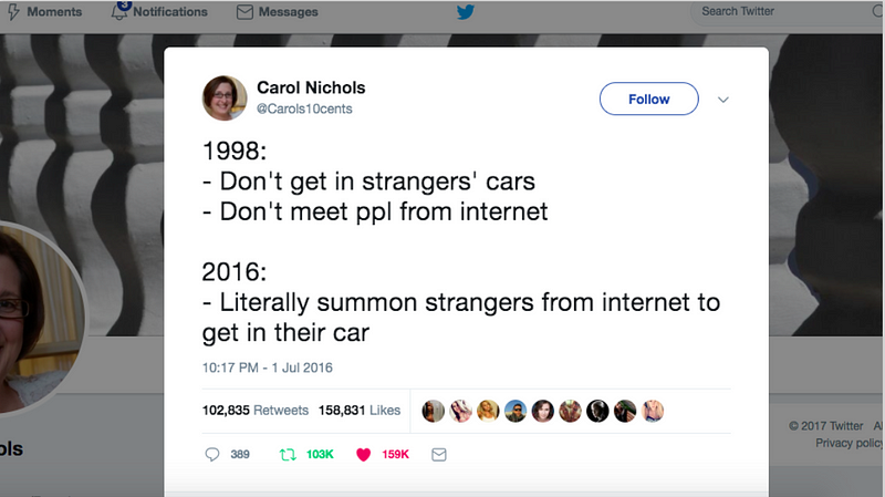
Another fun example is how when trains first came out, newspapers had scary headlines about the dangers of your organs flying out, because it was unnatural for humans to travel at such high speeds.
So how can we apply this to what we design?
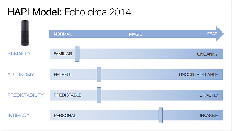
Here are a few quick examples. Now, I just made these up based on general media response — but how we could know this in practice is through user research, usability testing, and all the other ways we get to know our customers.
Echo when it first came out 3 years ago: People knew Siri and AIs, but… It’s always listening?
Alexa today: Little kids love her and she appears on Saturday Night Live.
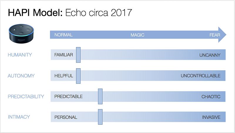
But earlier this year with the release of Echo Show and Look, you see some of that fear factor bubbling up again, around things like the camera, or Drop In feature, or placement in the bedroom:
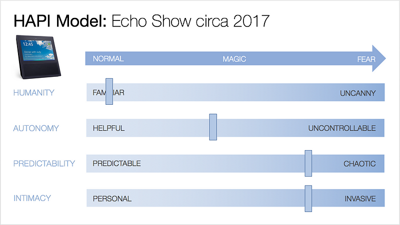
We can use it to be intentional about who we design for — from early to late adopters of new technology, high to low privacy vs. convenience trade-off types, or whatever other personas can be built around these dimensions.
Imagine a 1–5 score applied across these dimensions, resulting in an overall score. (In my next talk, I’ll show you how exactly to apply it to design reviews and usability testing or user research.)
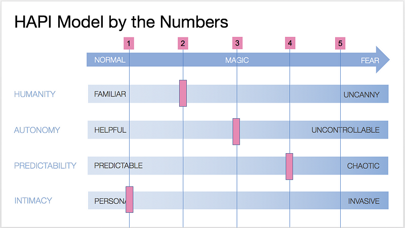
So back to my earlier question:
How can we do better than “I know it when I see it?”
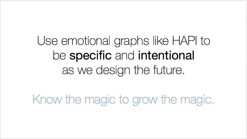
It’s through having a model or language we can use to talk and think about designing the future for our customers.
Know the magic to grow the magic.
Thank you!