Chasing Ektar 100: Why I Made the "Zürich" Recipe for Ricoh GR IV

A colorful tale from a monochrome lover.

When I do color, I do color.

While I usually work in black & white for both photos and the short films I make on my Ricoh GR camera — I also love ultra vivid and bold color, especially for film photography.

I’ve long been inspired by the look of ultra-saturated, cooler-toned emulsions like Kodak Ektar 100. I’ve spent a few years chasing the look for my digital camera and finally have been able to create exactly the look I want to capture my beautiful city of Zurich, Switzerland.

Presenting: ZÜRICH for Ricoh GR IV

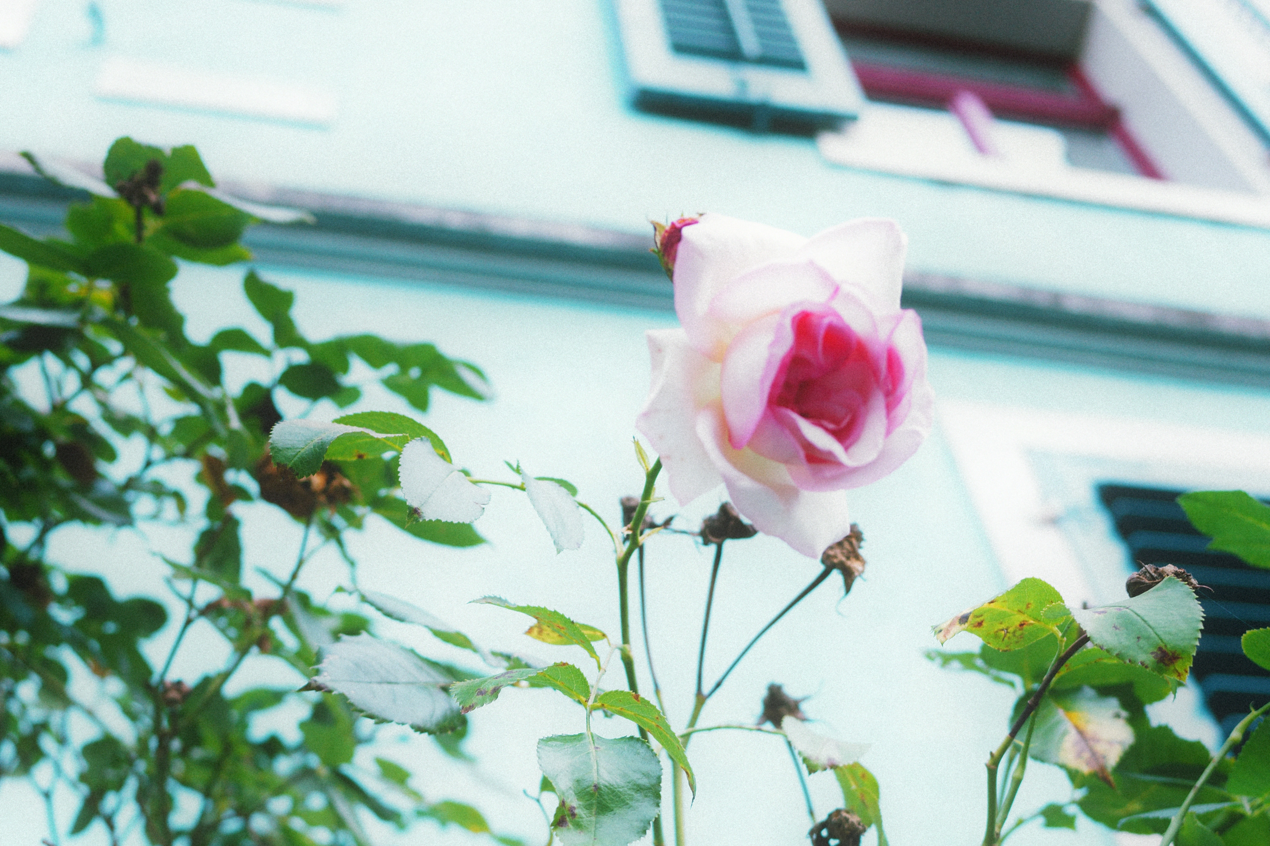
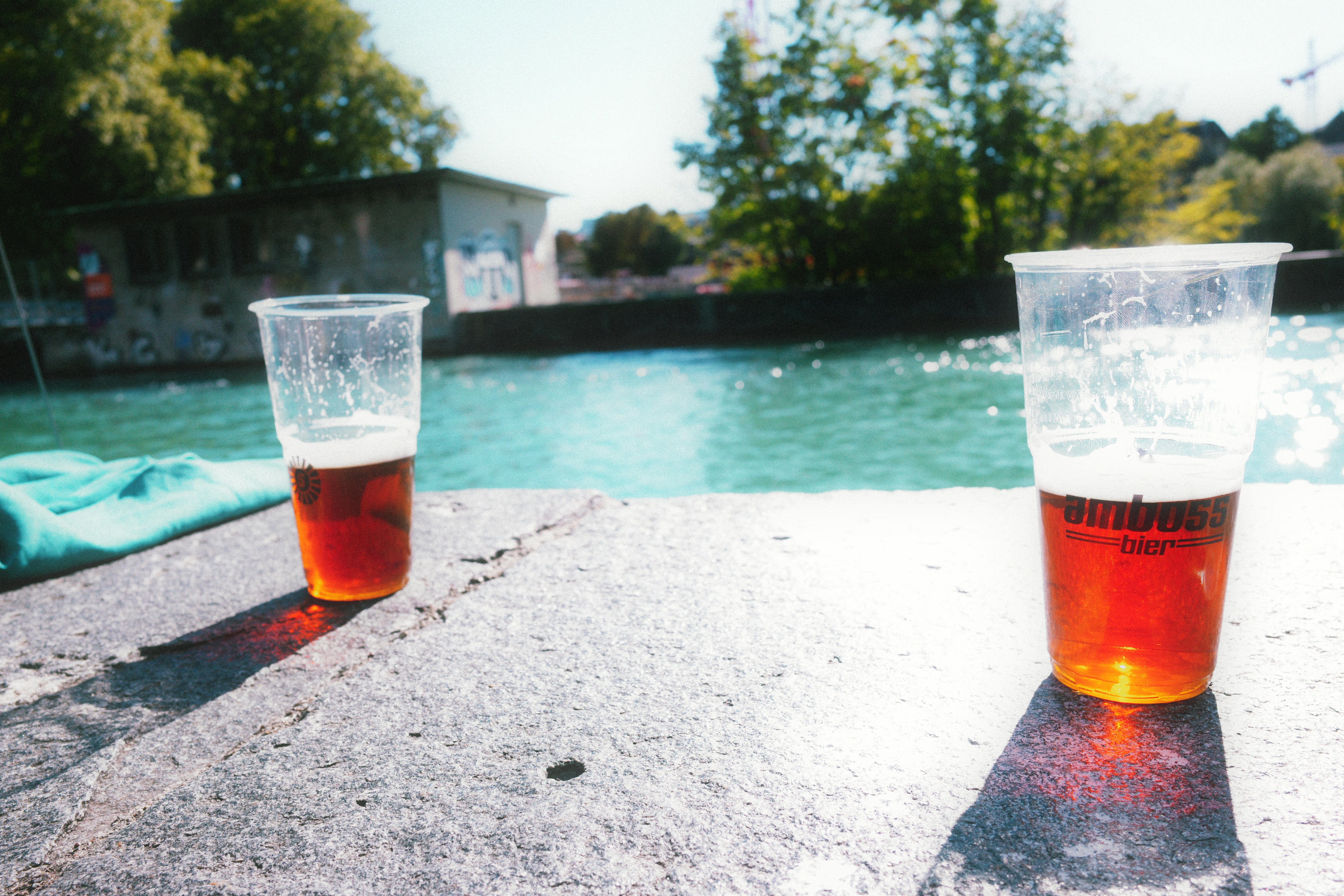
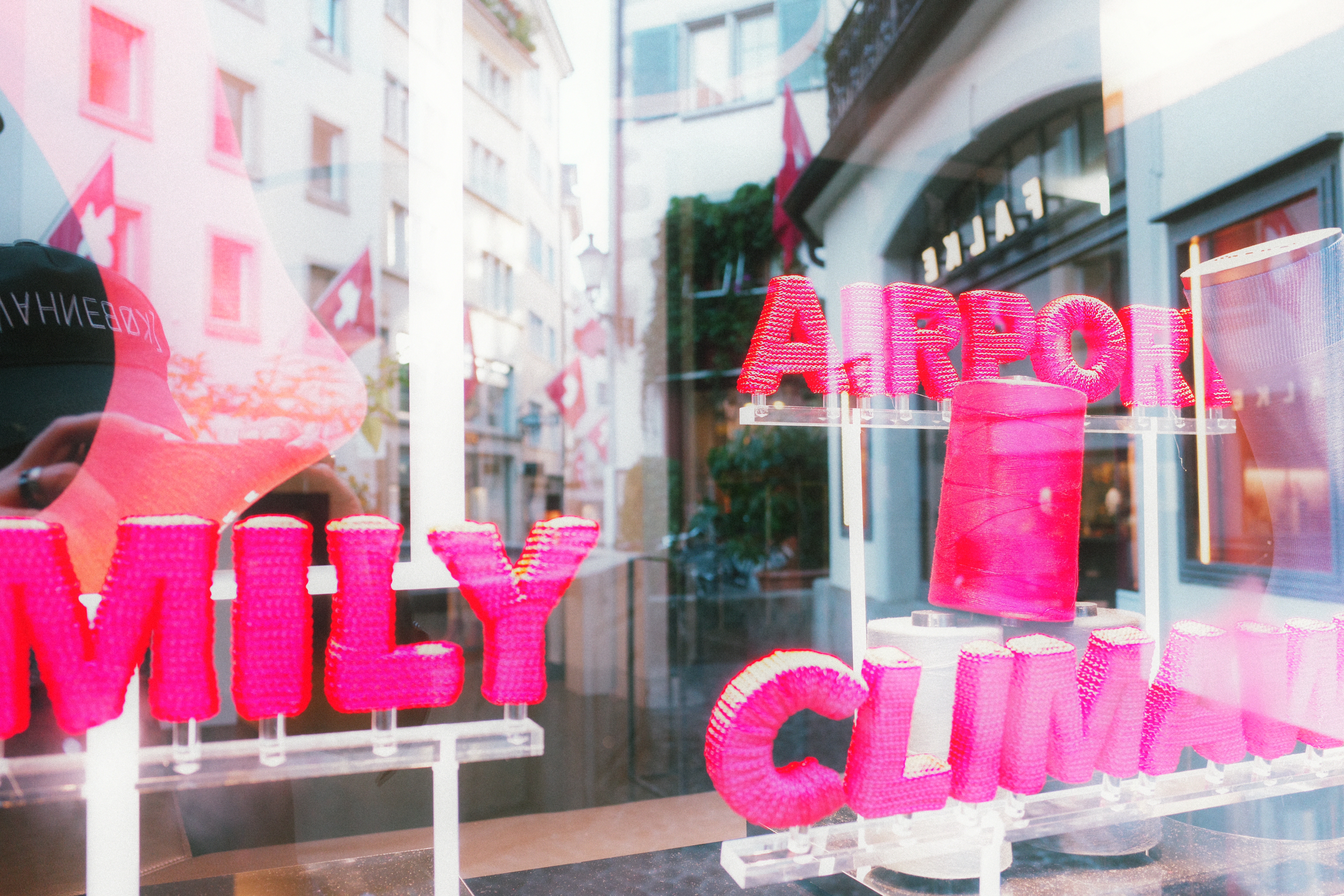
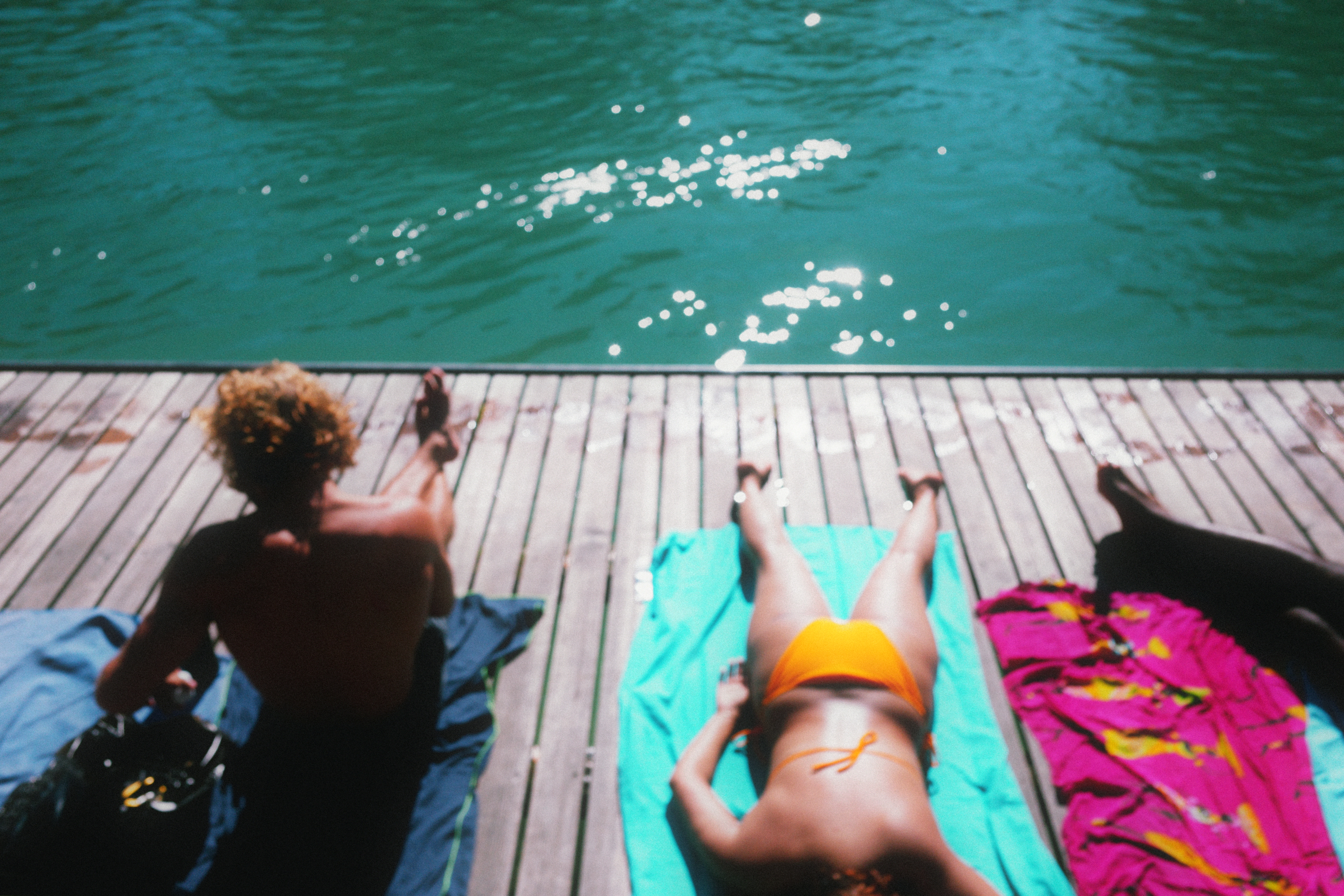
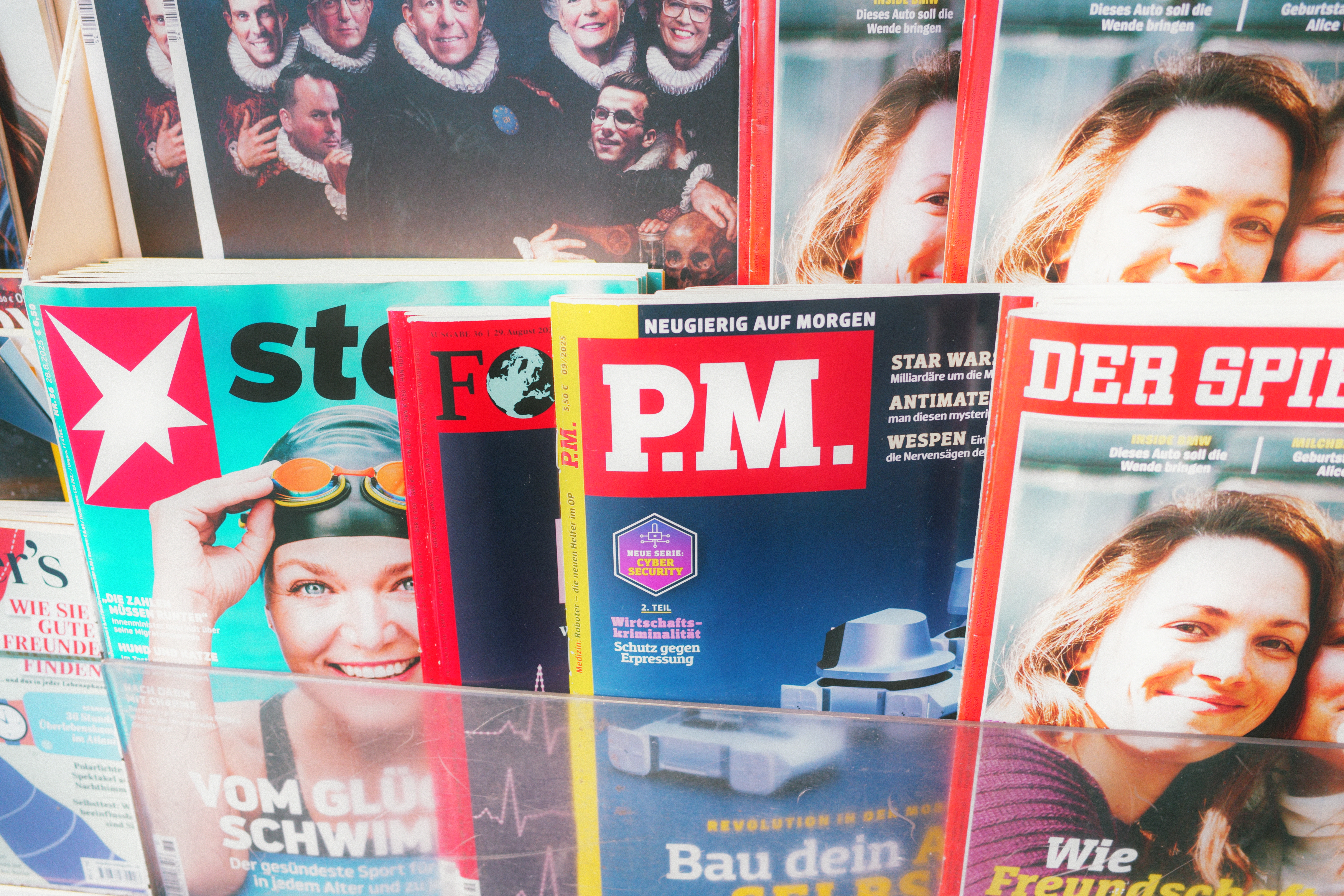
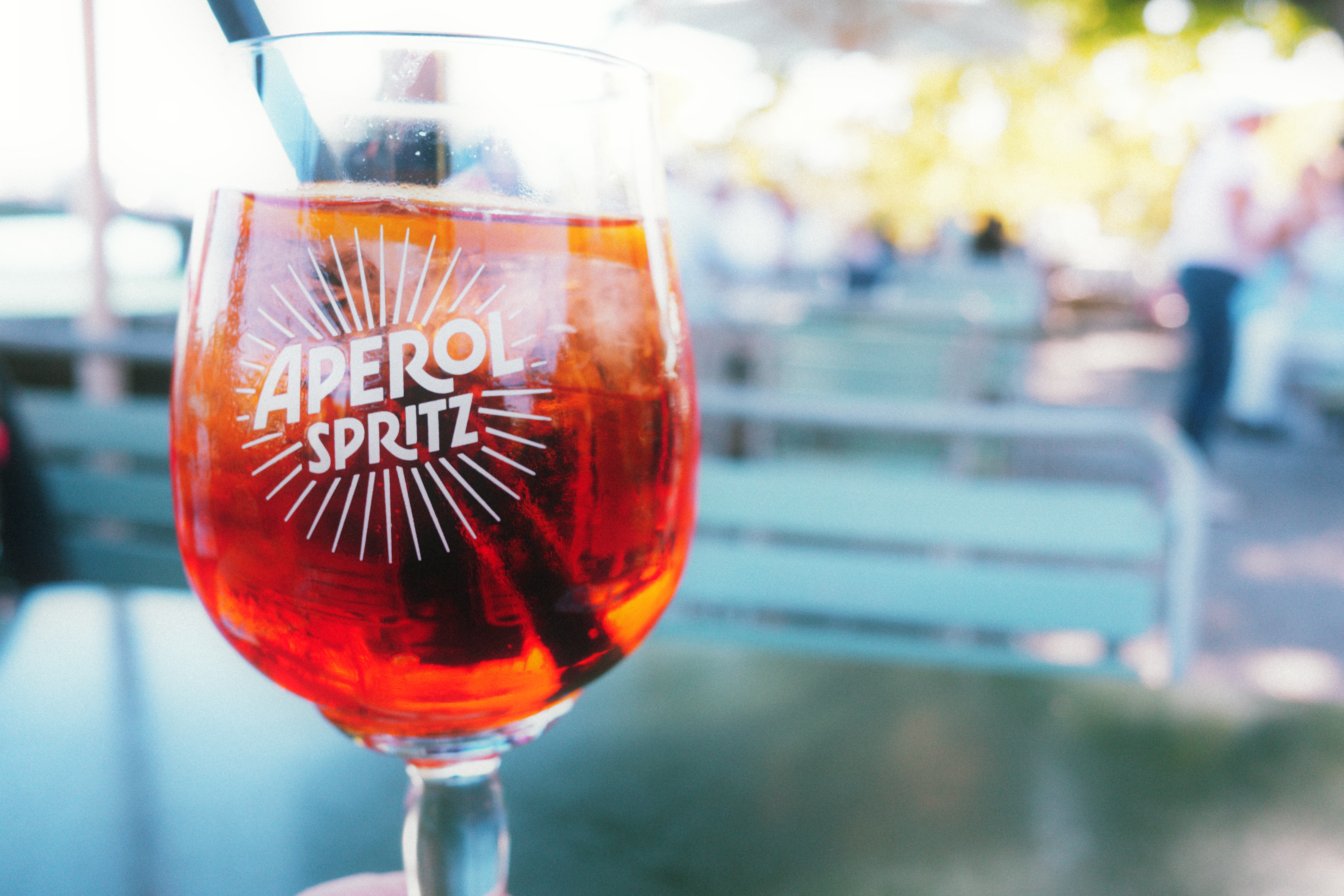
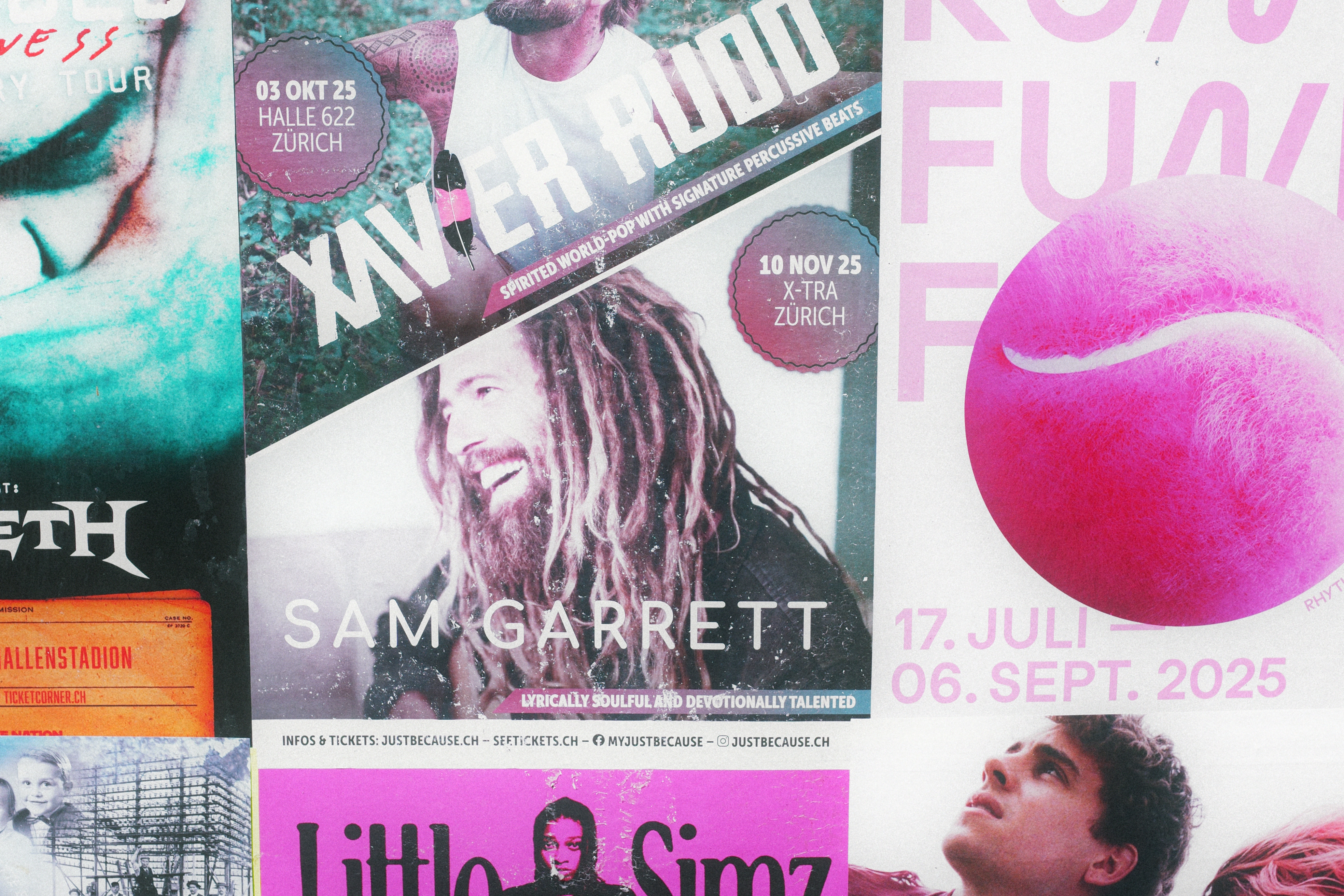
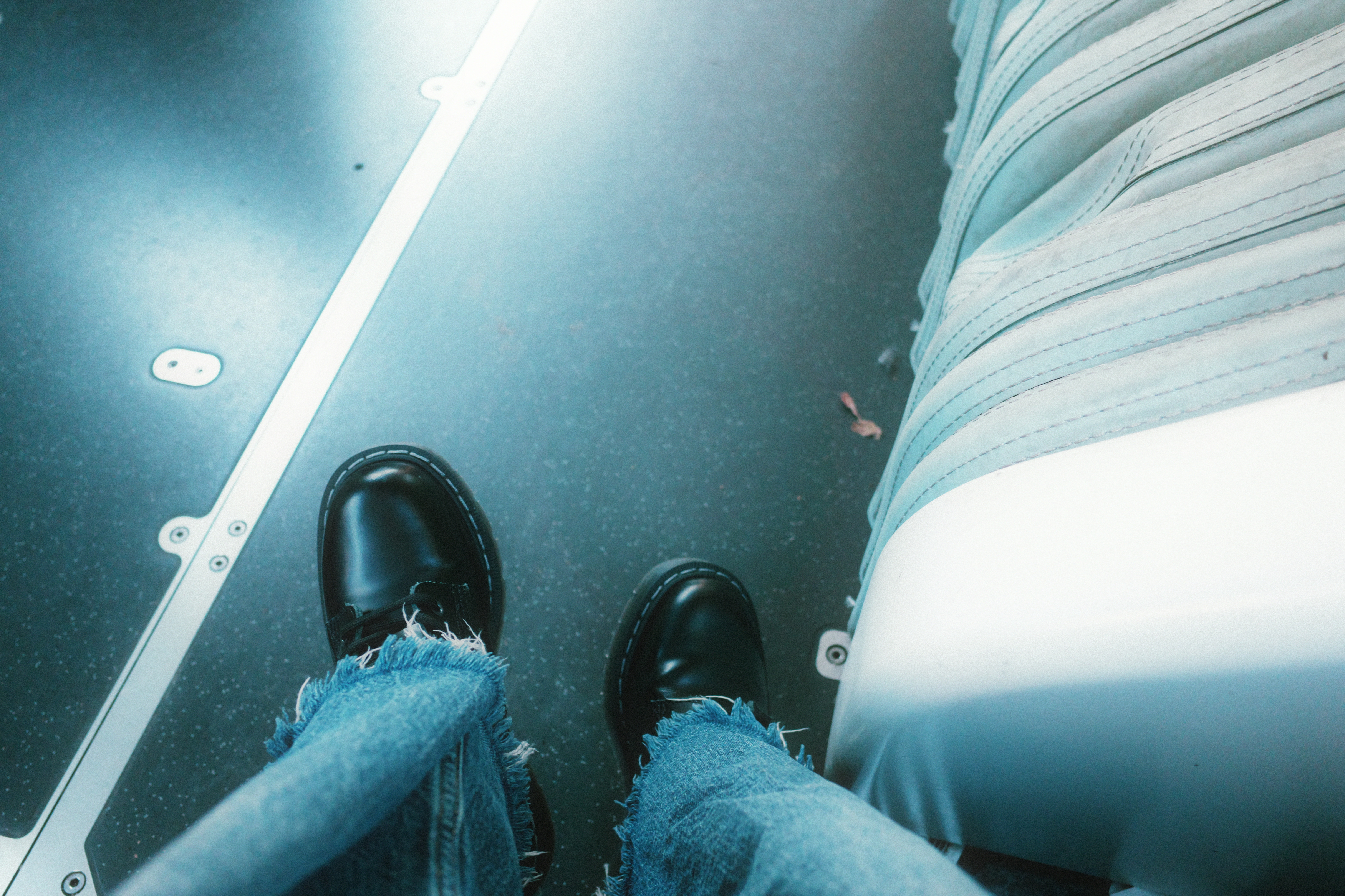
People often think of Zürich as cold, grey, all-business, and monotone. But the Zürich I’ve gotten to know since moving here last year is one of vibrant blue rivers, green leaves, expressive graffiti, graphical posters, and garden flowers around every corner.

I generally don’t edit my photos and like to work straight out of the camera (SOOC). I used to spend hours in post-production, but these days I set up my camera to do the work for me — and I really enjoy creating “recipes” that can achieve that. I was excited to be able to preview the new GR IV camera recently and try out its new profiles — including Cinema (Green) which this is built on.

Here are some recent snapshots I took using ZÜRICH:


See more examples and get the recipe here:


Until next time!

Keep shooting. :)

Posted in

11 responses to “Chasing Ektar 100: Why I Made the "Zürich" Recipe for Ricoh GR IV”

  1. KewtieBird’s Photo Journey Avatar
    KewtieBird’s Photo Journey

    That’s a very fun color palate! Interesting series.

    1. JILL.PHOTOS Avatar
      JILL.PHOTOS

      Thanks so much KB! I’m having a lot of fun with it — it makes me see differently.

  2. Alicia Paley Avatar
    Alicia Paley

    Lovely images. I love the color palette! However, I find it interesting that you say Ektar is cool toned. I find it very much a warm toned film and Portra to be cool toned. – My most recent post is about Ektar.

    1. JILL.PHOTOS Avatar
      JILL.PHOTOS

      Thank you for the thoughtful comment, Alicia — it’s helping me to better articulate the nuances of what I mean. I checked out your Project 365 (#12) which is super interesting (instant follow!). When I say cool-toned vis-à-vis Ektar, I mean it more in the sense of hue than temperature, i.e. how it pulls toward blue vs. yellow, pinkish reds, etc. I’ve shot a lot of Ektar film recently (on a Fuji Natura S — I love compact like you :)) — here are the results of that — https://jillphotos.substack.com/p/jills-journal-week-of-882025

      I love the “debate” between you and your son on Porta vs. Ektar — that’s amazing you can have that conversation. :) I think Ektar is super sensitive to ambient light, even more so than other film stock. From your photos I think you are in southern Cali? Where I am in central Europe (and before in the Pacific Northwest), the light tends cooler — even when bright it’s less yellow/orange. I like it as I have an aversion to warm tones :), and it can be a challenge to strive for saturation/depth without them. Thank you for the lively conversation!

      1. Alicia Paley Avatar
        Alicia Paley

        First of all, thank you for the instant follow! Also, thanks for providing a link to your article on Ektar. Those were great images! I do see that your photos have a cooler cast to them than mine do. It’s interesting what you said about the tonality of natural light. I don’t think I’ve ever thought about that. You’re right, Southern California’s light is very golden. Perhaps that’s why I think Ektar is too red, most of the time. I’m sure with you being averse to warm tones, a film such as Portra, known for its cooler tones, would render images in a cooler palette more to your liking. It would be fun to see how Portra and Ektar measure up in your area’s lighting compared to mine.

        One of the things I love about Substack is this kind of engagement and interaction!

      2. JILL.PHOTOS Avatar
        JILL.PHOTOS

        Me too! Thanks, Alicia. : )

  3. Paul Votava Avatar
    Paul Votava

    I need a GRiV lol! Nice hues!

    1. JILL.PHOTOS Avatar
      JILL.PHOTOS

      Thanks so much, Paul! Me too! : ) I’m hoping for a firmware update that brings the Cinema (G) to a wider audience.

  4. Leon Goossens Avatar
    Leon Goossens

    This recipe looks amazing! The only thing I’m missing is a Ricoh camera… 😉

    1. JILL.PHOTOS Avatar
      JILL.PHOTOS

      Minor detail! The same principles can be applied elsewhere, but I will wish to the universe for one for you. :)

  5. Jack S Avatar
    Jack S

    Hi! Great recipe. I can see how I’d use it. I enjoy vivid color.Question: what do you set the following items at? Thanks! If you say it in the video, I apologize because I just took a screenshot at the end thinking I was being smart that way. :D

    Highlight Correction
    Shadow Correction
    Peripheral Illumin. Corr.
    Noise Reduction

Leave a comment