Behind the Scenes: How I Designed JOURNAL

The adventures of creating a photobook.

Books are small galleries.

Galleries are small cities.

Layout is navigation is wayfinding is design.

How do human eyes and bodies travel across a landscape, building, room, wall, website, app, book, or page? It all comes down to the same elements and principles of design.

Here is a quick look at the thinking that went into the first issue of my new magazine JOURNAL —No.1:

1. Inspiration
2. Type/Layout
3. Experimentation


1. Inspiration

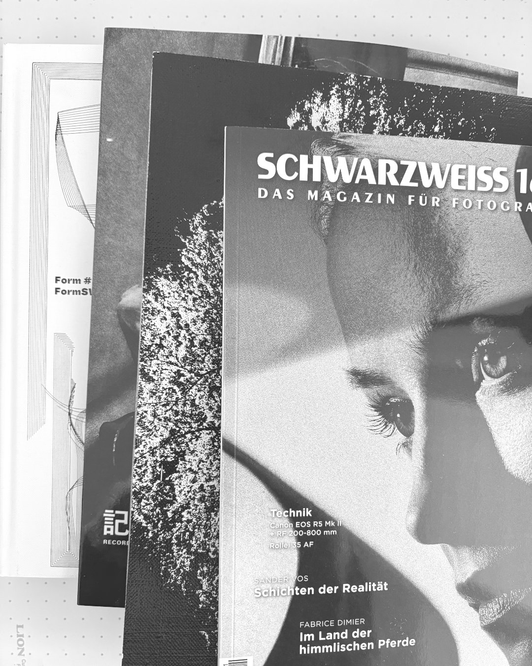
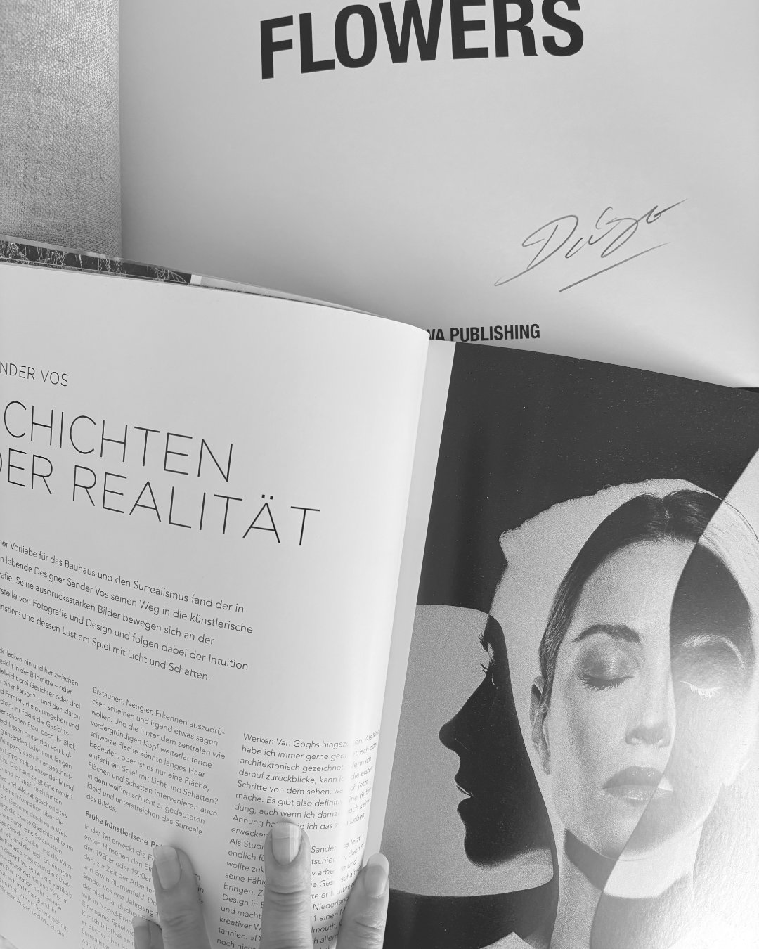
I looked online and through my own collection of photography and art books, magazines, and zines.

How do they look?

How do they feel in the hand?

What makes something feel like a magazine vs. a book?

Type of paper?

Cover design?

Images and text?

What do I like and not like?


2. Type/Layout

I decided on International Typographic Style (or Swiss Style) — a minimalist, grid-based, type-forward style that is a perfect showcase for photography.

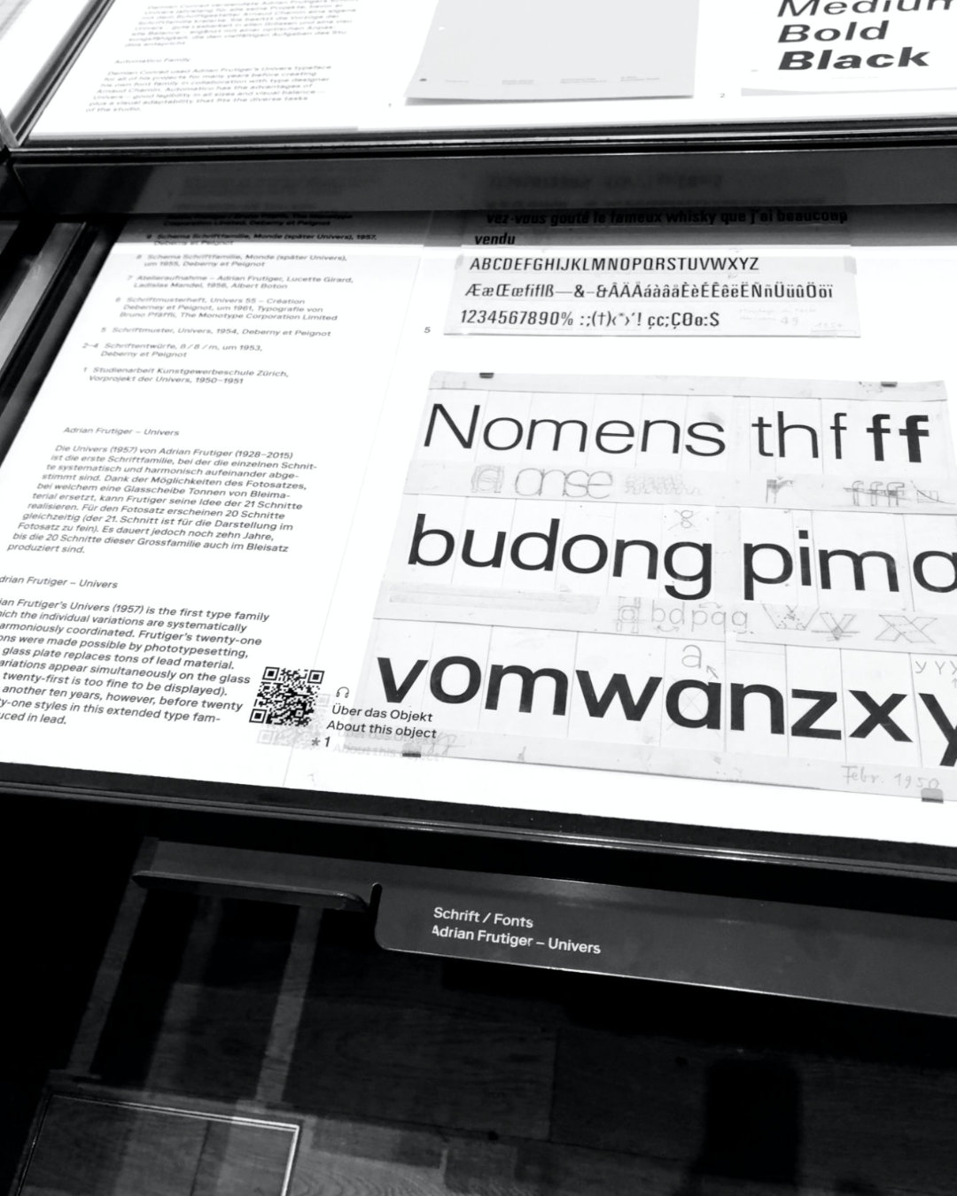
Helvetica is a well-known typeface of the style, but I wanted something a bit more “imperfect”/Humanist like Univers — but with a whiff of technological/sci-fi feel.

I visited the Swiss design museum here in Zürich (Museum für Gestaltung) to study classic poster design and the history of some typefaces I had in mind.

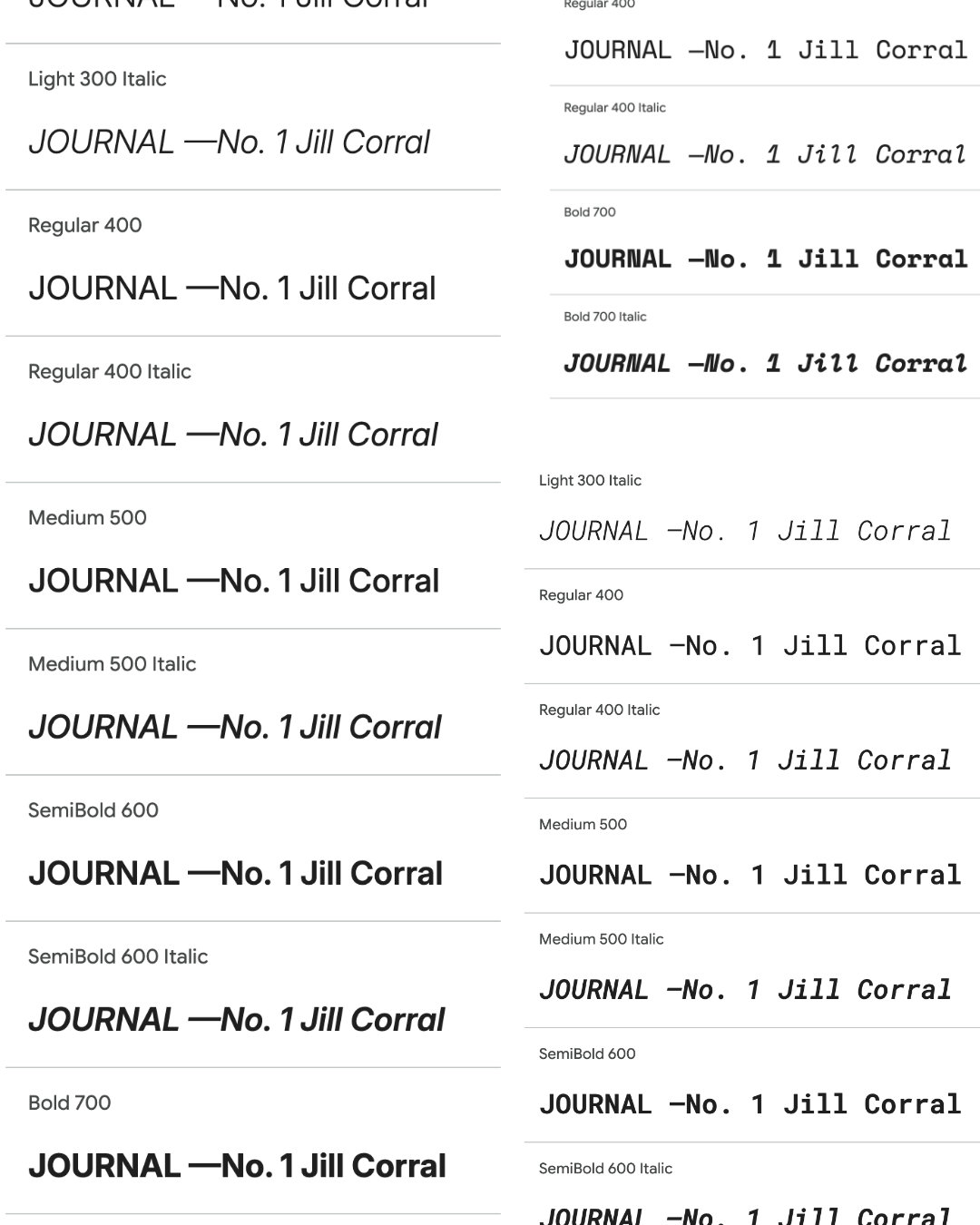
JOURNAL uses Inter, Inter Tight, Roboto Mono, and Space Mono — all open-source, open-license fonts.


3. Experimentation

JOURNAL is the result of 1000s of macro and micro experiments.

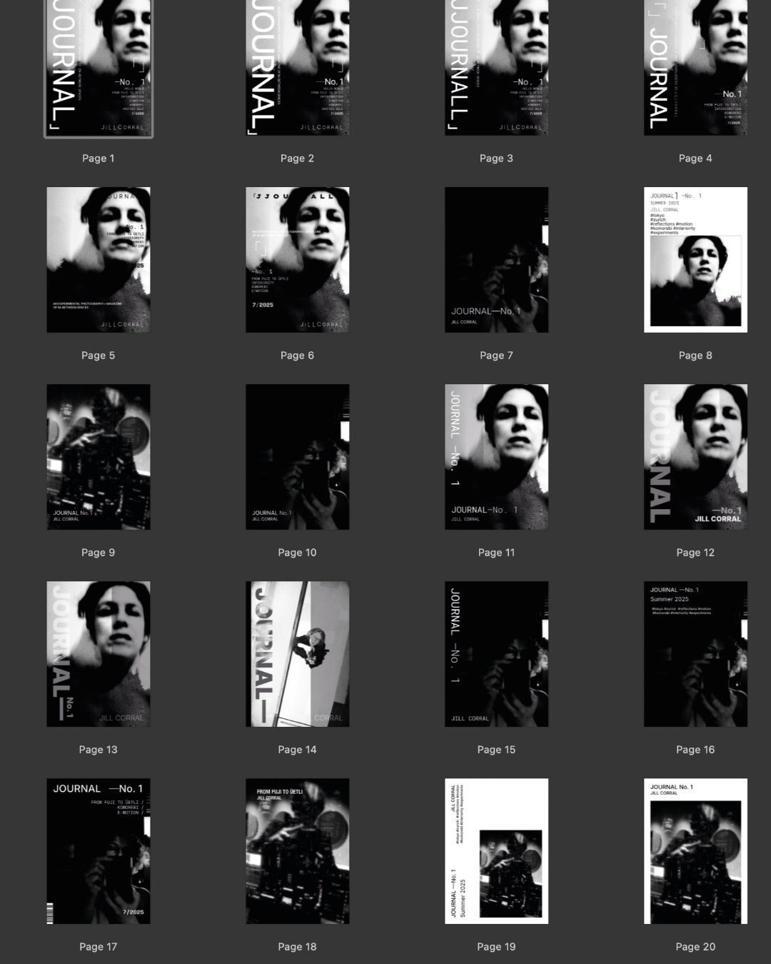
For the cover alone, I made ~40 versions— each different in titles, text, typefaces, images, and arrangement.

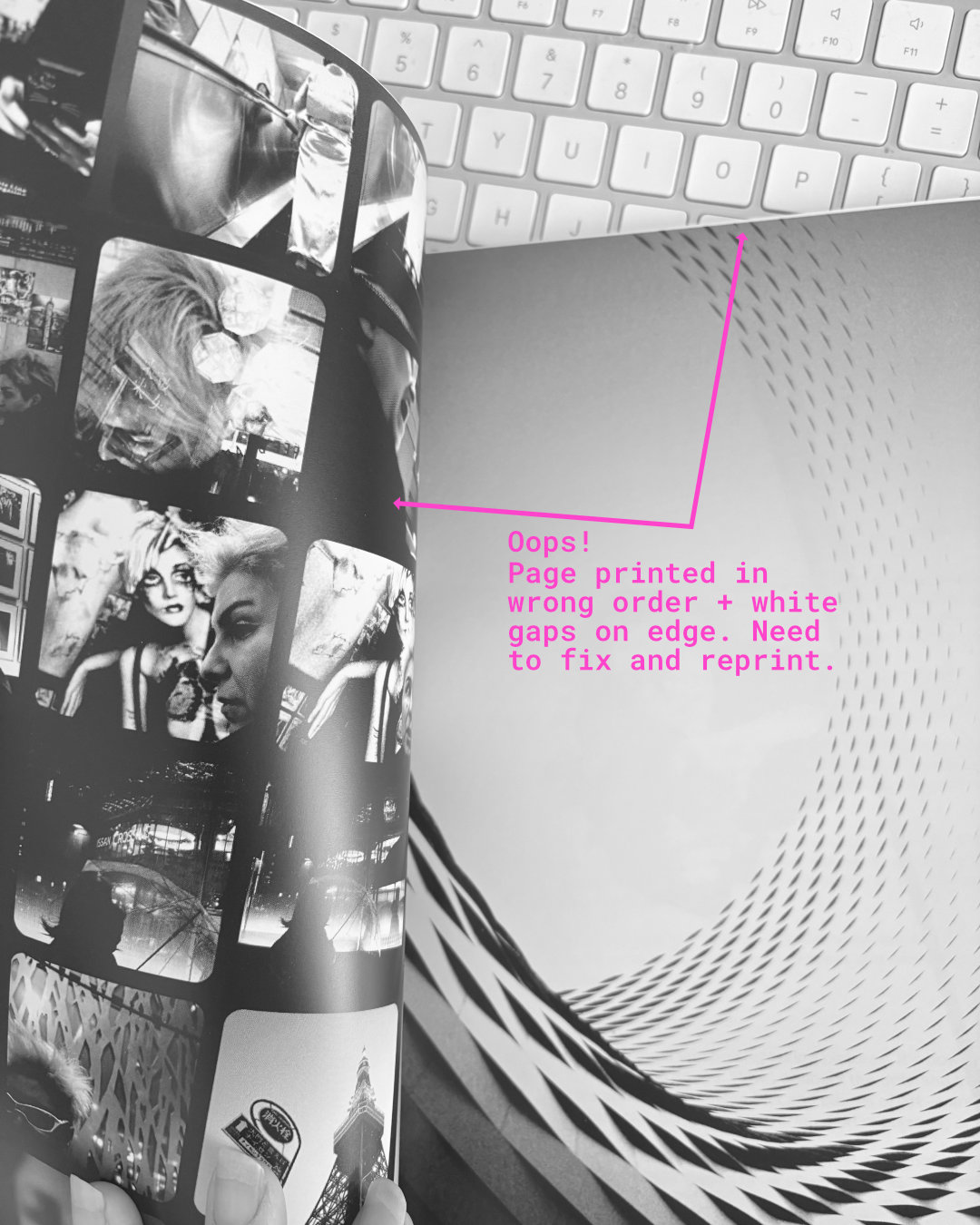
From image selection, to layouts for distinct content types (articles, photo essays), to sequencing, to ordering print samples copies and then revising whole formats or sections — every page is the result of a myriad decisions born of passion, technical constraints, exacting standards, and story. True alchemy and invention.

This first issue builds a strong, adaptive foundation for future issues.


JOURNAL —No. 1 is available on Amazon and Blurb.

As ever, thanks for reading!

Posted in

13 responses to “Behind the Scenes: How I Designed JOURNAL”

  1. Crina Prida Avatar
    Crina Prida

    thank you for letting us find out more about your design process. I find these things very informative and interesting.

    1. JILL.PHOTOS Avatar
      JILL.PHOTOS

      Thank you so much, Crina. I love hearing about others’ creative processes and enjoy sharing my own.

  2. Matthew Poburyny Avatar
    Matthew Poburyny

    How is the print quality from these two on-demand print services for monochrome photography? I have tried Blurb in the past and found that they shared a common issue for monochrome printing, in that the resulting images had a colour cast on them (in some instances, passable, in other cases, absolutely not). I have never used Amazon for print-on-demand. Is Amazon linked to Blurb, and are they the ones handling the printing process? How do you feel about relinquishing quality control to the printer alone, without being able to review the consistency of print quality? These magazines will only be produced as they are ordered, instead of you ordering the magazines in batches, checking them individually, and then disseminating them yourself. I only ask because I have had issues with printers in the past (currently dealing with a problem with Mixam on my latest zine), which has led me to be quite anal about quality control. I am wondering how you feel about it, and with your test copies, were you sufficiently satisfied with the results and confident that the printer would deliver quality copies to your customers?

    1. JILL.PHOTOS Avatar
      JILL.PHOTOS

      Excellent question, Matthew — this is so much of the process and you raise some interesting points. My goal with creating a magazine vs. a book is (among other things) about reach, i.e. mass global/scalable availability is more important than having a perfect art object. (I did create also a limited Collector Edition of 10 that I handled personally.) To that end, Amazon and Blurb meet that goal and standard. I’ve published several books on Amazon, incl. a photography-rich cocktail book, that all came out great — I’ve ordered them myself in U.S., Japan, and Germany and they are fine. (Tip: Use the “Premium” color paper if you go with them, it is much nicer for photos than the default intended for text.) Amazon and Blurb are not related in way. Blurb I have used in the past for hardcover photobooks and they were always good. Of course, I always order copies to proof before I put for sale. Most of my experience publishing in the past was in U.S., where there were many more and options for printing/print-on-demand than here in Switzerland, e.g. where it is super expensive, zero POD shops (i.e. no link for people to buy), and Mixam won’t even deliver here. I was going to try Mixam at one point, but heard too much about quality/delivery issues. It comes down to your goals for distribution and to trust. I am a designer by trade who can see to the pixel and the sublest difference in color shade, and I am pleased with my current versions. I’m happy to answer more questions as I’ve done a ton of research/testing on this front.

  3. Paul Votava Avatar
    Paul Votava

    This is a huge help for those inspired by your work and wanting to give a book/zine a go. Thank you 🙏🏼

    1. JILL.PHOTOS Avatar
      JILL.PHOTOS

      Thank you so much, Paul – that is exactly what I’m trying to do. I am on a mission to demystify book/zine-making and inspire people to create their own.

  4. Mark Foard Avatar
    Mark Foard

    Thanks for sharing this, Jill. I really love your magazine and this shows how much work and thought went into producing it. Your efforts were really worthwhile.

    1. JILL.PHOTOS Avatar
      JILL.PHOTOS

      Thank you so much, Mark — your words are the kindest an artist could hope to hear. Deeply appreciated.

      1. Mark Foard Avatar
        Mark Foard

        You are most welcome, Jill.

  5. Leon Goossens Avatar
    Leon Goossens

    I saw the preview of your magazine. It’s beautiful! So thank you for sharing the whole process behind this magazine and the dicissions you had to made. It’s very interesting to read this

    1. JILL.PHOTOS Avatar
      JILL.PHOTOS

      Thank you so much Leon! I’m glad to discover your articles and hear about your own processes.

  6. Filianna Karamanli Avatar
    Filianna Karamanli

    Thanks for sharing a little bts! I love seeing the obsession with the font experimentation and the name of the font used. Gives me hope that I’m not a total weirdo 🤣

    1. JILL.PHOTOS Avatar
      JILL.PHOTOS

      Yesssss! Thank you, Filianna. You are my people — font obsessives are extremely welcome here. :)

Leave a comment